Spotify repeat button
· 5 min read
A few days ago, my son discovered a song called Fart on Spotify. Not surprisingly, the track prominently features sounds made by the back-end of the human body, which sparked plenty of joy for my first-grader. So, he wanted to listen to that song over, over, over, over, over, over and over again. He pulled up Spotify to turn the repeat mode on but the repeat button mysteriously disappeared from the player screen…
I looked at the Spotify screen myself and the intense concentration while scanning Spotify's controls made me a little dizzy. I doubted myself and became anxious. In disbelief, I googled “spotify repeat button” and found out that I wasn't the only one confused and disappointed. There was already an ongoing drama on Reddit and Twitter.
Spotify's latest UI update hid the button under the “…” menu in the top-right corner requiring two taps to enable the repeat mode instead of one. Let's look at user experience implications before diving into potential reasons for why Spotify did this.
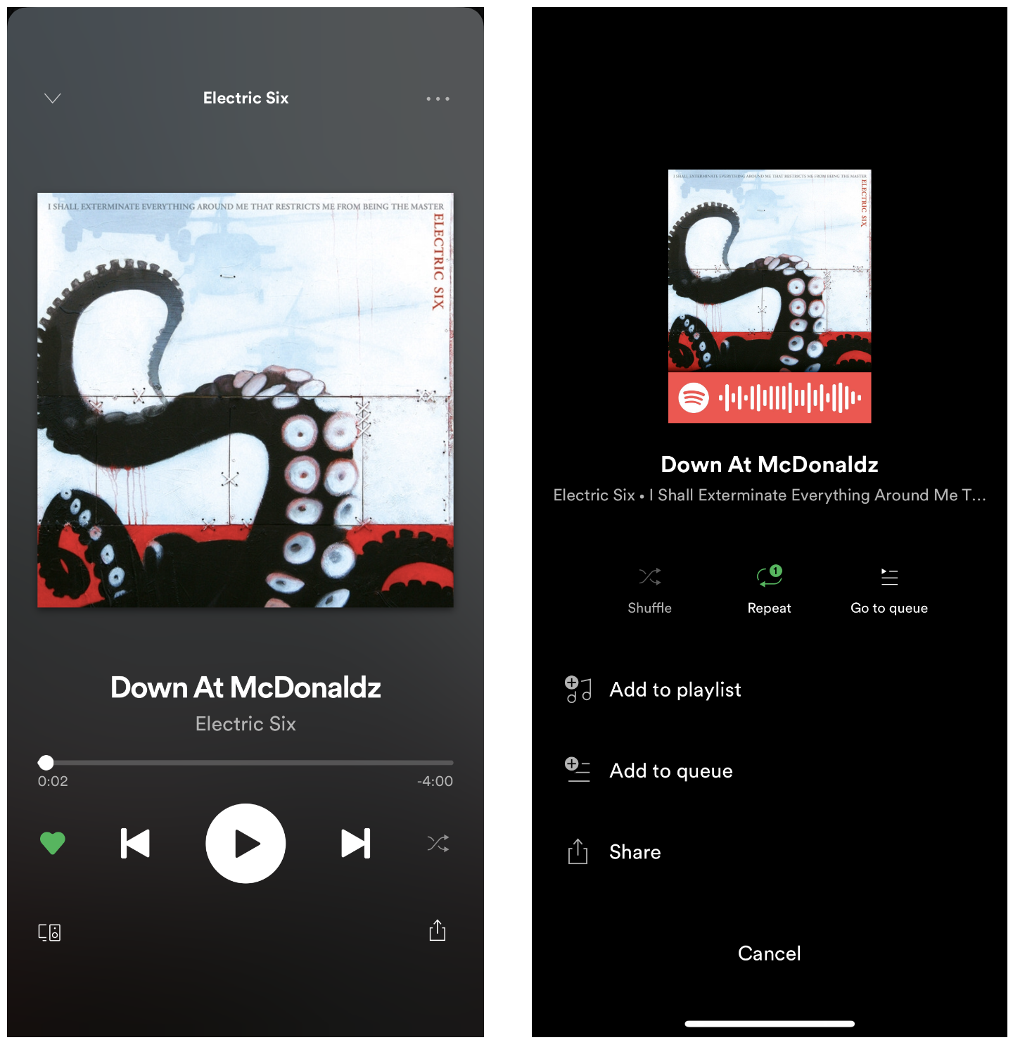
UX issues with moving the repeat button
- Hard to access. People with relatively small hands, like mine, can't easily reach the menu while holding an iPhone X or phones of similar sizes with one hand.
- Unsafe when driving. If you want to enable repeat mode while driving, you'll have to spend more time looking away from the road while tapping the screen.
- Missing telemetry. If you want to check if repeat is on, you can't see it at a glance. Tapping the menu creates an unnecessary friction.
- Breaking the patterns. Breaking an existing pattern in applications that people use day-to-day is generally a bad idea. It messes with people's habits and inhibits them from achieving their goals. This is not a reason not to change UI layouts but “if it ain't broken, don't fix it” is a safe rule of thumb for most scenarios.
How could they miss such an obvious regression?
The Verge reached out to Spotify about the changes and the response was “We are always testing new products and features, nothing to share at the moment.”
The response doesn't mention what kind of testing was done. They might have meant unit testing but let's give them a benefit of the doubt and assume they meant user testing. Either testing was not done well or the sample of testers was not representative of the repeat aficionados they managed to anger with the update, which @chillmage snarkily called a “software downgrade” in a tweet.
In the era of Twitter and Reddit, companies should pay extra attention to user testing prior to releasing controversial changes. At the very least, there should be a mechanism to quickly roll back. Otherwise, users get angry, backlash ensues, trolls abound. Think Apple Maps circa 2012.
Why did Spotify move the repeat button?
I don't know for sure but let's hypothesize.
Spotify took away an essential control from the audio player and its disappearance coincided with appearance of an inconspicuous share button in the bottom-left corner. The space on a mobile phone's screen is extremely limited, so, to add a new control, something had to give. We can make a conclusion that sharing was deemed more important than repeating.
My hypothesis is that Spotify wants you to share what you listen to, so that your friends and followers click on the link and use Spotify more or become new Spotify users. More shares equals more engagement and user acquisition, that's how social networking works.
Spotify went public in April 2018, which means they now have an increased pressure to be profitable and show continued growth. Competition from Apple Music, YouTube Red, Google Play, Tidal and Amazon Music eating into the Spotify's user base certainly doesn't help. Music streaming has become a commodity and there isn't much Spotify can do to lock in its users other than nurturing users’ love and offering them extraordinary user experience, which so far they have.
The repeat button update is a step in a wrong direction that made me, a loyal Spotify user, unhappy. It has put a dent in my otherwise spotless relationship with the service. This experience made me explore what it would take to migrate my music collection to another streaming service if I had to. I looked up Spotify's API to see how easy it is to export my playlists and I can totally migrate if I want to. In other words, music streaming is a commodity indeed.
Is it only about music?
In early February 2019, Spotify acquired Gimlet Media, a high-profile podcasting company, and Anchor, an app for making podcasts. Spotify had podcasts on the platform for a while but these acquisitions signal that podcasting is an important piece of Spotify's strategy and they want to beef up the podcasting content.
The repeat button doesn't make sense for a podcasting app but sharing totally does. Unlike music, podcast episodes are mostly centered around a particular topic of interest. If I am a Product Manager and I liked a This is Product Management‘s episode, there's a high chance my product colleagues will find it valuable too and will appreciate me sharing it.
Podcasts have high utility because of the knowledge they provide, just like an article or a book. Music, on the other hand, is very subjective. With music, it's a matter of taste. With podcasts, it's a matter of utility.
I may be seeing correlation where there is none but the UX update coincided with Spotify going bigger on podcasts. Optimizing controls on the player for podcasting without properly testing the change for music is not unimaginable.
What's next?
I wonder whether Spotify will revert the change, how long it will take and whether the share button will stay in the player. My forecast is that they will revert the change within a couple of weeks, the share button is not going away, and, if anything, the share button will become more prominent over time.